Pinnacle Group
Brand identity
Connecting the disparate divisions of a large organisation with a strong yet flexible visual identity.
The Pinnacle Group of companies (or Pinnacle Regeneration Group) was founded at a time when government policy encouraged private investment into what had traditionally been publically funded services such as utilities, transport, schools and housing.
Driven by the ambition to become a leading regenerator of housing stock and of the social fabric of communities across the UK, the group has since grown to meet a wide range of needs and opportunities, developing numerous subsidiaries that operate in a variety of fields. This resulted in an organisation with little in the way of a cohesive identity, prompting the decision to rebrand, albeit retaining key characteristics such as the Pinnacle name.
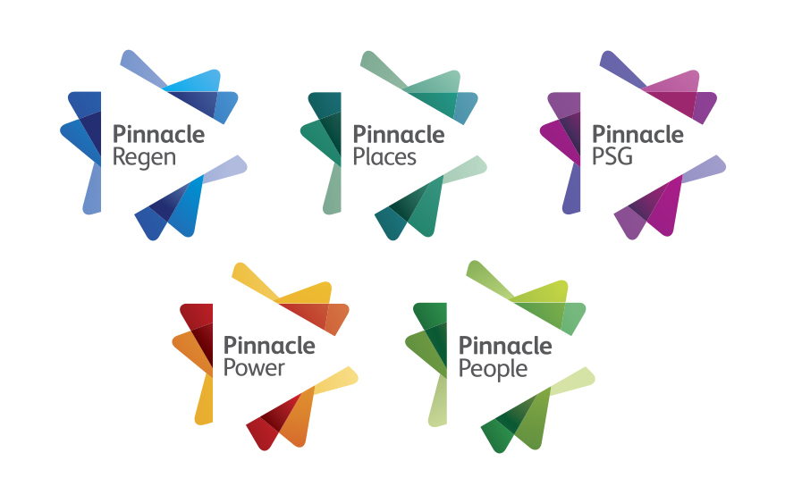
The aim of the project was to galvanise the individual subsidiary companies around a compelling brand story, a shared set of core values and a unifying corporate identity that would reflect the strengths of the group without compromising the integrity of its component parts.
Following a period of intensive research, during which we engaged with key players from across the group, we devised a brand narrative and visual identity with the clarity and consistency needed to unite the group, and the flexibility to grow with the organisation.
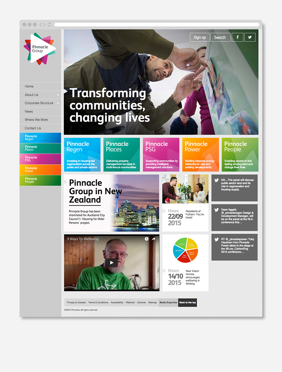
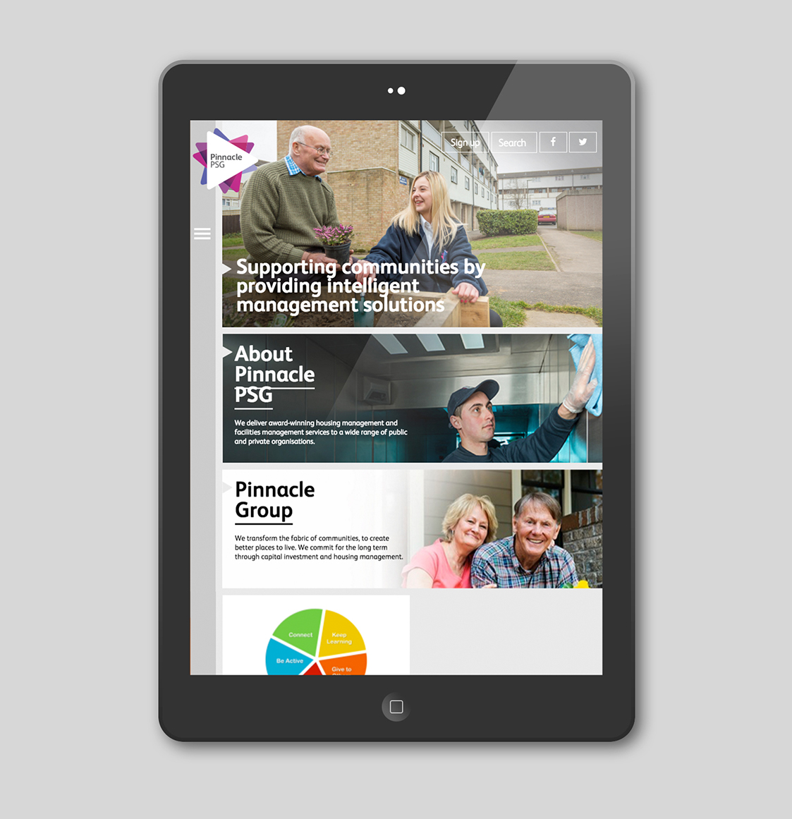
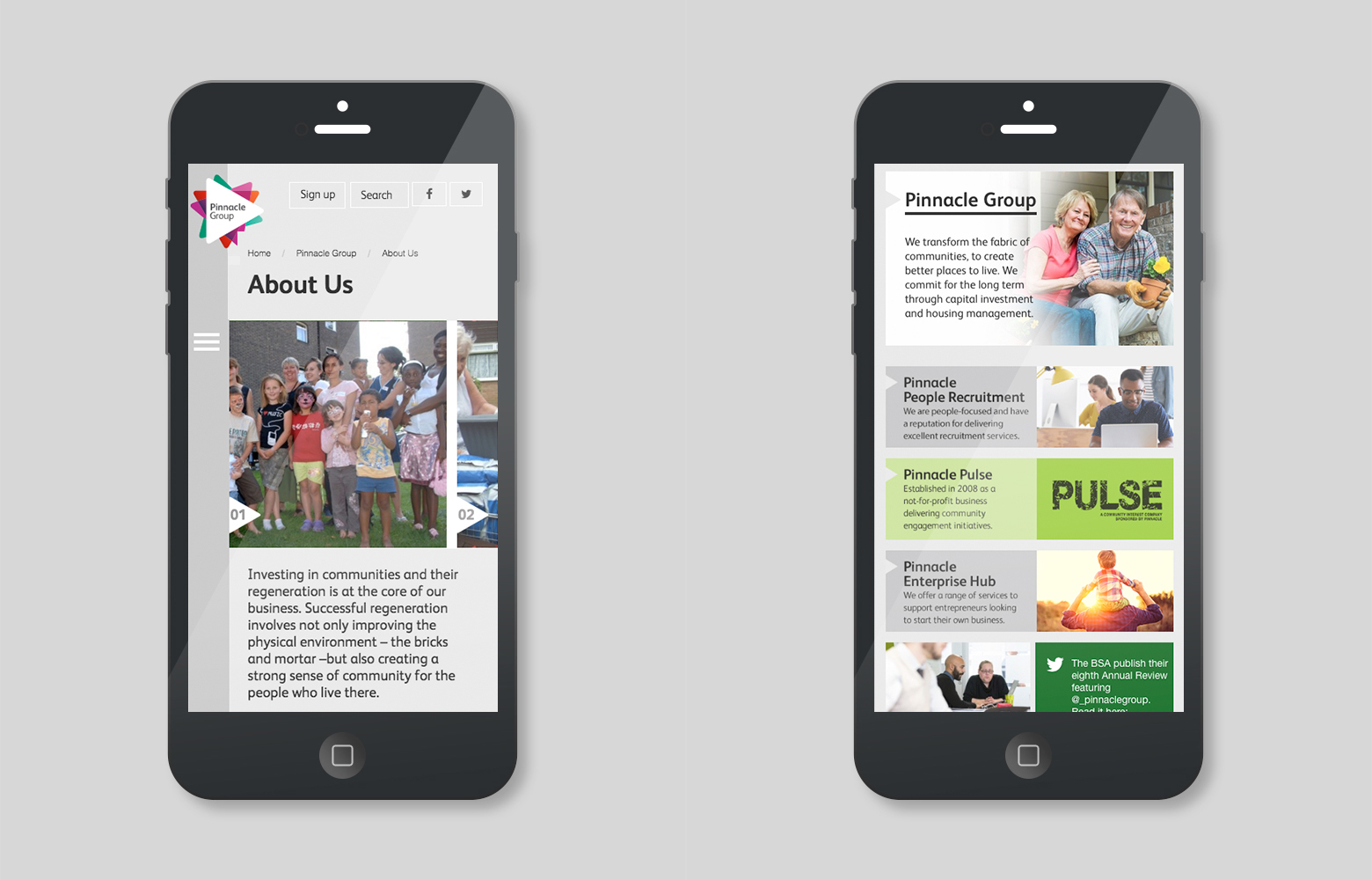
We rolled out the identity across a group-wide website, vehicles and staff uniforms, as well as providing visual identity guidelines and hands-on support to Pinnacle’s in-house marketing teams.
